Banking App
A tokenized banking system built for systematic multi-brand rebranding.
My Role
Led product and foundation design for a zero-to-one white-label banking platform, defining the token architecture and scalable component system.
The Problem
No shared foundation, no reusable components, and aggressive multi-client timelines required a systemized, rebrandable solution.
Impact
Shipped a fully tokenized banking system that enabled rapid multi-brand launches.
System Architecture
How it works
Tokenized Foundation
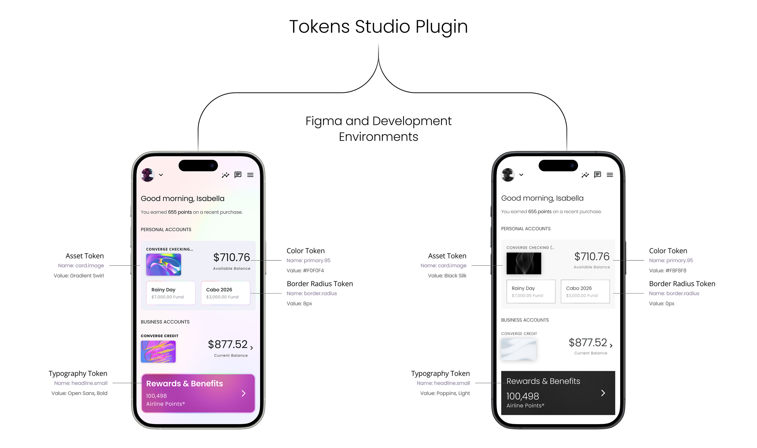
Built the system on a fully tokenized foundation derived from core primitives including color, spacing, typography, border radius, and assets.
Cross-Environment Integration
Established a direct token export pipeline into development environments, reducing design-to-code drift and enabling synchronized updates.
Composite Component Strategy
Introduced composite components capable of mapping to alternate token values per brand, enabling controlled variation without structural duplication.
Structured Component Layer
Developed 70+ scalable banking components mapped directly to token values to ensure consistency and predictable implementation.
Multi-Brand Adaptation
Architected the system to support white-label rebranding, allowing visual identity shifts without redesigning core product structure.
International Scalability
The architectural model was adopted across multiple countries, validating its scalability beyond a single client implementation.
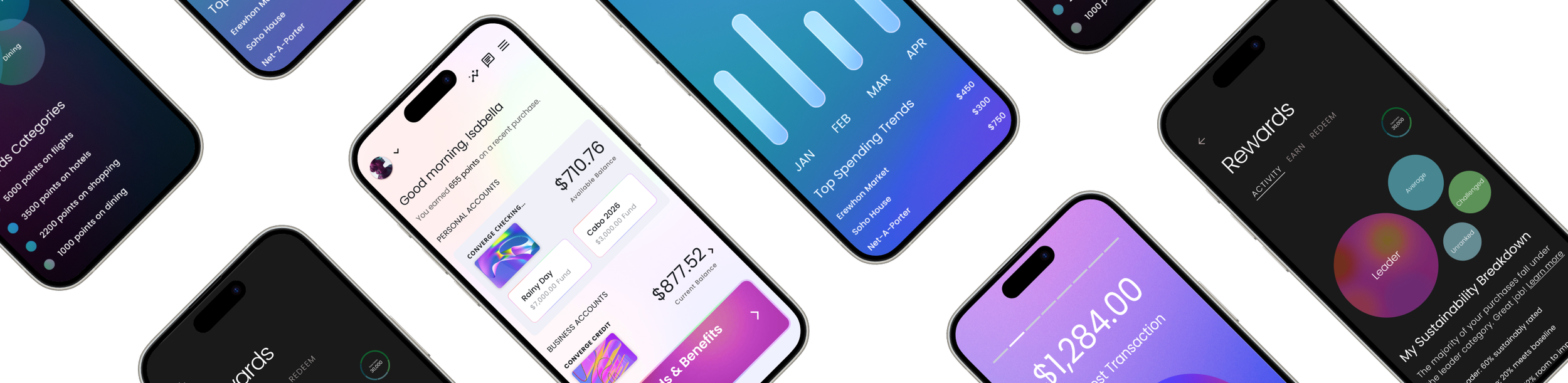
Rewards
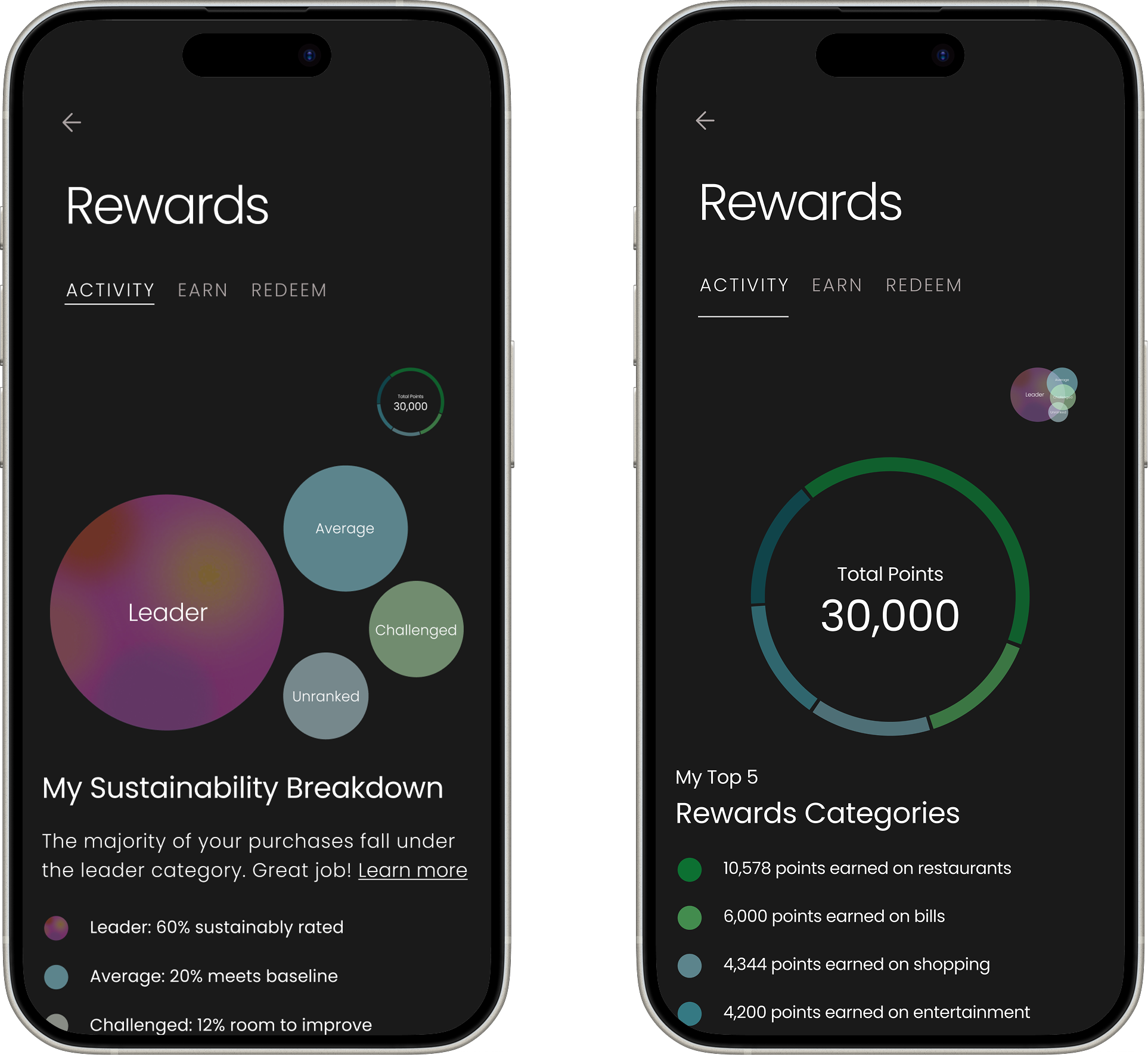
I designed the Rewards experience to help users quickly understand their sustainability impact and rewards breakdown. I initially explored more complex visualizations like a treemap, but when I ran early usability testing myself, it became clear that users struggled to explain what they were seeing or how to interpret the data.
Based on that feedback, I simplified the experience into two scannable views: a bubble summary for fast pattern recognition and a category ring for deeper exploration. This iteration reduced time to comprehension by roughly 40% in testing and eliminated the need for explanation, allowing users to understand their rewards status at a glance while keeping the experience visually engaging.
Cards Design
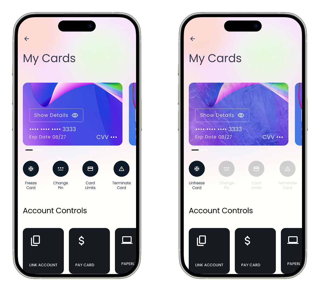
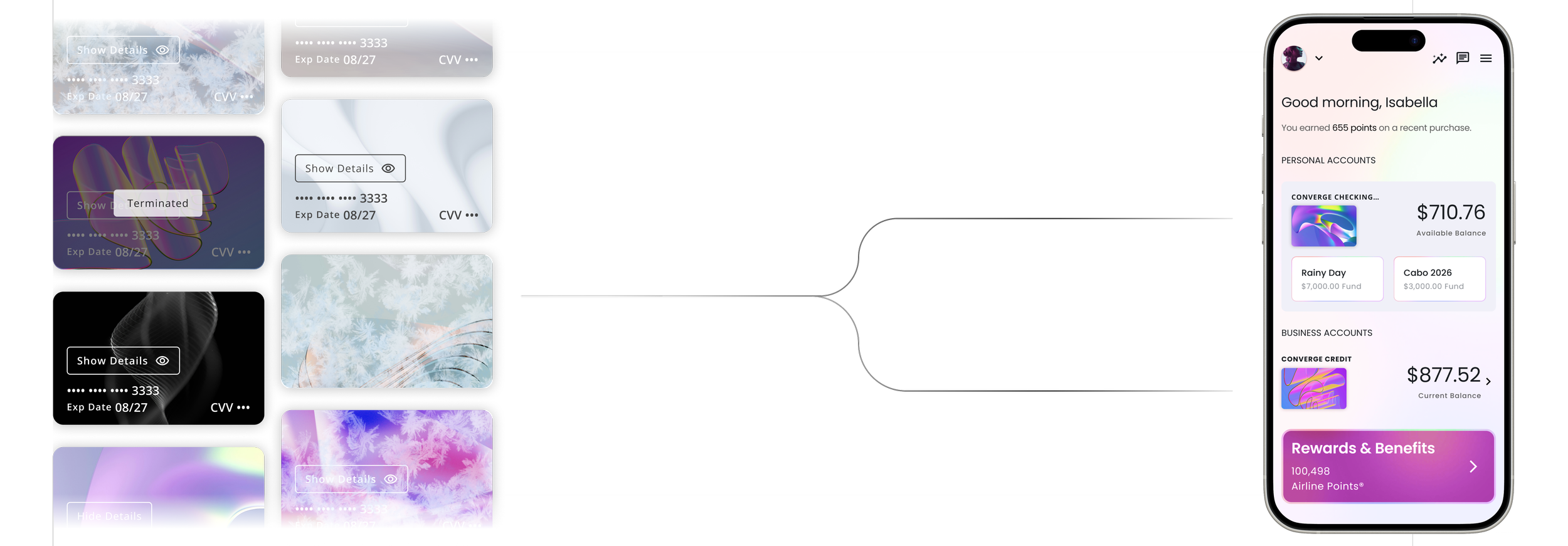
Originally, card actions lived in a stacked list farther down the screen. It was complete, but slow: users had to scroll, hunt, and then double-check they were acting on the right card, especially when managing multiple cards. In early sessions we saw hesitation around high-impact actions like Freeze and Terminate, plus a lot of back-and-forth just to confirm they had the correct card selected.
We iterated by moving the most-used actions closer to the card and adding quick-access controls (Link Account, Pay Card, etc.) as dedicated modules instead of burying them in the stack. The intent was to reduce time-to-action while making risky actions feel deliberate. In testing, users completed common tasks faster, made fewer mis-taps, and reported higher confidence because the controls were grouped with the card context and the primary workflows were immediately available.
One Component, Infinite Variations
Building on Material 3, I created custom banking components including dashboards, cards, onboarding, status modules, alerts, and tiles. Each was designed as a scalable variant connected to the token system, ensuring consistent styling and predictable implementation for engineering.
Build Once, Brand Anywhere
Using Material 3 as the foundation, I customized our core design primitives and mapped them into Token Studio with M3 naming conventions. This became a unified source of truth for design and engineering, enabling every screen in the product to be fully tokenized and automatically brand-adaptive.