I owned the design and architecture of a multi-brand icon system, working directly with brand and engineering teams.
My Role
Designers rebuilt icons at every size, colors lived outside the system, and updates didn’t scale. Teams shipped more slowly.
The Problem
Impact
Shipped a tokenized icon system with 2500+ icons used across 20+ brands. The icons have been used over 15,500 times across 93 files.
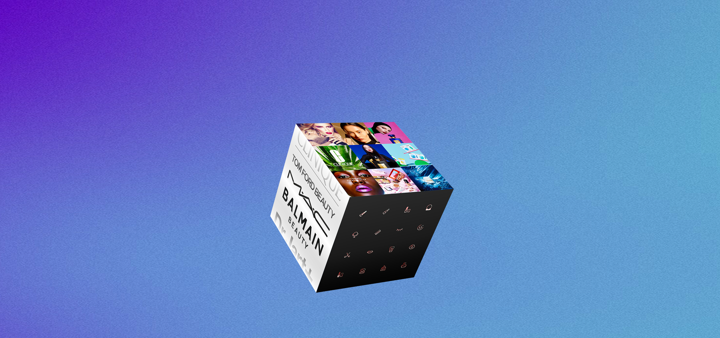
Multi-Brand Icon Library
A shared icon system that keeps experiences intuitive for users and easy to evolve across brands.
Key Challenges
No shared icon logic
Icons came from multiple libraries with different vector rules, scaling behavior, and color logic. I rebuilt the incompatible sets into a unified format so all icons could inherit tokens, scale predictably, and behave consistently across brands.
Rebuilding vs Scaling
Each icon previously existed as three separate size variants, which made updates slow and fragile. I designed a nested component architecture where icons are created once, with size and color controlled at the wrapper level.
Brand chaos
Custom brand icons were built inconsistently and often broke system behavior. I standardized and re-vectorized them so brands could keep their identity while staying inside the shared system.
Multi-Brand Icon Foundation
System Architecture
Keyline Standardization
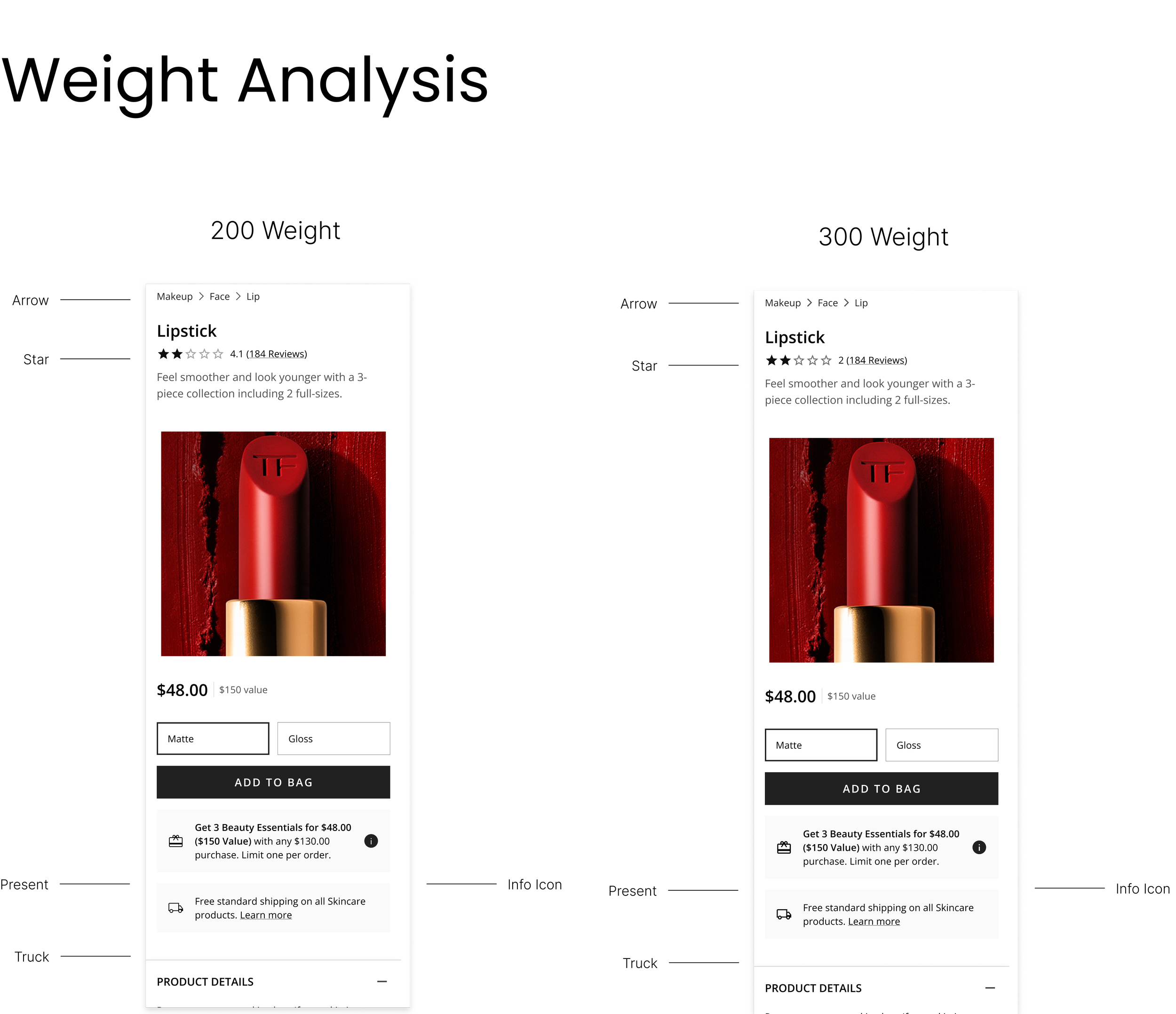
Normalized all glyphs within a structured keyline icon grid to ensure optical balance and alignment across brands.
Stroke Weight Framework
Defined a 300 stroke baseline and created structured fallback weight sets to accommodate brand differentiation.
Component Wrapper Architecture
Encapsulated base glyphs within a scalable Icon component to centralize styling and behavior.
Variant Property Model
Implemented Size and Color properties to allow expansion without asset duplication.
Enterprise vs Brand Separation
Established a shared enterprise baseline while isolating brand-specific overrides to prevent system fragmentation.
Theming System Integration
Connected icons to the theming system to enable automatic brand adaptation across environments.
Icon Component Architecture
Icon Component Architecture
Fallback System
Fallback System
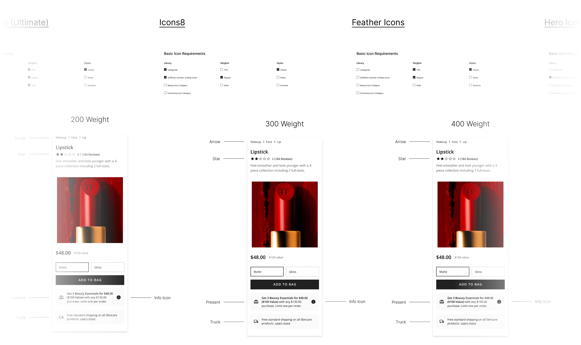
I began by evaluating several icon libraries to determine the best foundation for the enterprise. Material 3 provided the strongest starting point due to its style options (round vs sharp), weight options, and wide glyph coverage. I paired this with a custom vectorization workflow for beauty-specific icons from Icon Park.
I then collaborated with brand stakeholders to evaluate stroke weights, shapes, and stylistic directions, presenting multiple options and guiding the organization toward a unified weight and style that felt premium and aligned across brands.
Research, Selection & Stakeholder Alignment